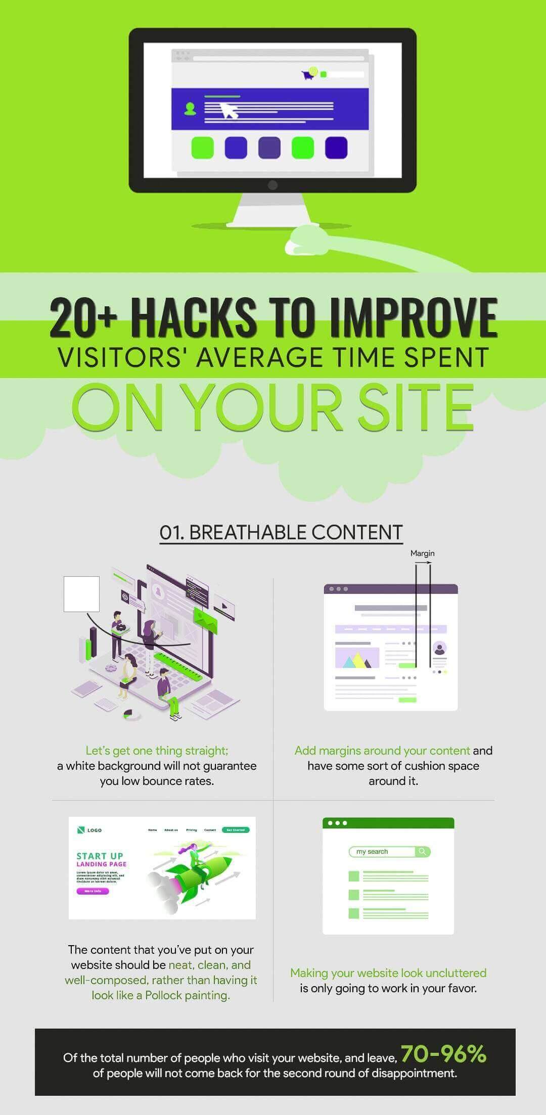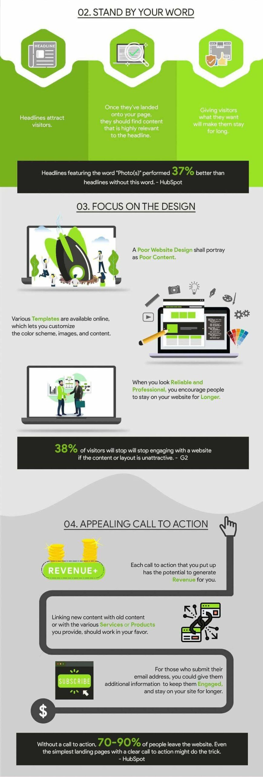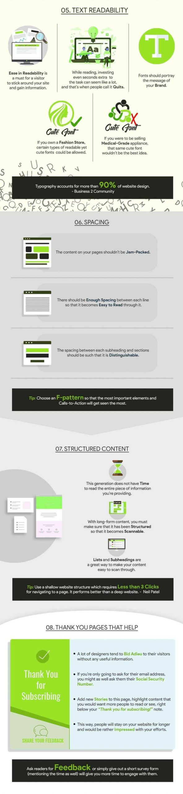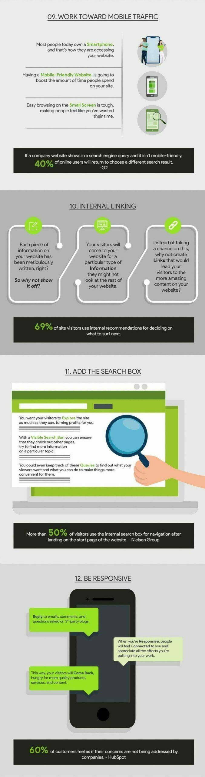
Creating Your Brand Strategy: 15 Questions Your Business Should Answer
Are you in the process of creating a brand strategy for your business? Want to learn the questions you need to answer to guide your marketing campaigns?
JH Studio shares its brand strategy tips in this infographic.
They break things down as follows:
- Focus
- Direction
- Connection
- Distinction
- Personality
Check out the infographic for more and see my thoughts on this very topic following the infographic.

In today’s competitive business landscape, a well-defined brand strategy is essential for long-term success. Your brand is more than just a logo or a tagline; it’s the essence of your company, what sets you apart from your competitors, and how customers perceive and connect with you.
To create a brand strategy that truly resonates with your target audience, you must first answer some fundamental questions:
- Who are we at our core?
- What is our mission?
- Who are we serving?
- Where are we trying to go?
- What impact are we trying to make?
Who Are We at Our Core?
At the heart of every successful brand strategy is a deep understanding of your company’s identity and values. What motivated you to start this business? What are your core values? What drives you to come to work every day?
Once you have a clear understanding of your core identity, you can begin to define your brand personality. How do you want people to feel when they interact with your brand? What kind of language and tone should you use in your communications? What emotions do you want to evoke in your customers?
What Is Our Mission?
Your brand’s mission statement is a concise declaration of your company’s purpose. It should encapsulate your core values and aspirations. A compelling mission statement should clarify your purpose and guide your decision-making.
When developing your mission statement, ask yourself:
- What problem are we solving for our customers or society at large?
- How do we want to contribute to the world?
- What are our long-term goals and objectives?
Once you have a draft mission statement, share it with your team and solicit their feedback. Your mission statement should be something that everyone in the company can embrace and rally behind.
Who Are We Serving?
Understanding your target audience is crucial for crafting a brand strategy that resonates with the right people. If you try to appeal to everyone, you risk diluting your brand’s message and failing to connect deeply with anyone.
To define your target audience, start by creating customer personas. Customer personas are detailed profiles of your ideal customers that consider demographics like age, gender, income, and location, as well as psychographics like interests, values, and pain points.
You can also conduct market research to gather data on your target audience’s preferences, behaviors, and needs. Look for trends, pain points, and gaps in the market that your brand can address.
Where Are We Trying to Go?
Having a clear vision for the future is essential for guiding your brand’s growth and development. It sets the direction for your business and serves as a roadmap for achieving your long-term goals.
To define your vision, start by setting SMART goals. SMART goals are Specific, Measurable, Achievable, Relevant, and Time-bound. Once you have a set of SMART goals, you can develop a strategic plan that outlines the steps, resources, and timelines needed to achieve them.
Your strategic plan should cover areas such as marketing, product development, operations, and financial management. It’s important to review your progress regularly and make adjustments as needed to ensure that your brand strategy remains aligned with your long-term vision.
What Impact Are We Trying to Make?
In today’s socially conscious world, customers are increasingly drawn to brands that make a positive impact on society and the environment. Your brand’s impact extends beyond just profit; it encompasses the social and environmental contributions you make.
To define your impact goals, start by identifying the specific social and environmental issues that your brand wants to address. This could include reducing carbon emissions, supporting local communities, promoting gender equality, or minimizing waste.
Once you have defined your impact goals, develop a plan for achieving them. This plan should identify specific initiatives that your brand will implement, as well as the resources and timelines needed to execute them.
It’s also important to be transparent and accountable about your impact initiatives. Share your progress with your audience and acknowledge areas where you’re still working to improve. Customers appreciate honesty and authenticity.
Conclusion
By answering the fundamental questions outlined in this guide, you can develop a comprehensive brand strategy that will help you achieve your long-term business goals and make a positive impact on the world.
Remember, your brand strategy is a living document. It should be regularly reviewed and updated to reflect your company’s growth and evolving goals.